Hi, I’m James. Thanks for checking out Building Momentum: a newsletter to help startup founders and marketers accelerate SaaS growth through product marketing.
Get the next post in your inbox
Practical product marketing and GTM ideas, weekly.
SPONSORED
SavvyCal — Scheduling Software Everything Will Love
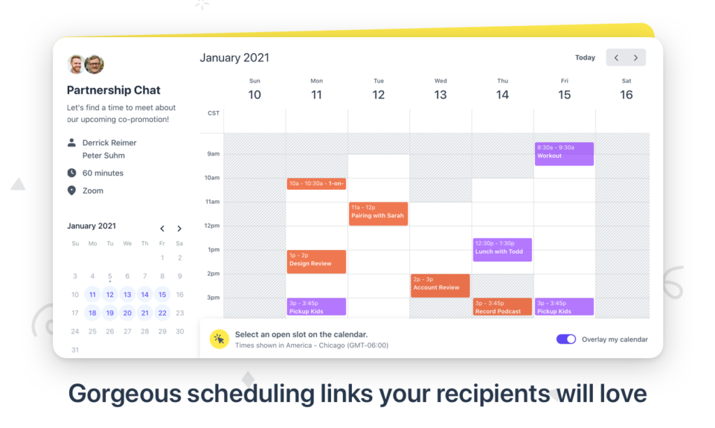
Give your schedulers a calendar, not a list of time slots. Allow recipients to overlay their calendar on top of yours to easily find mutual availability. Connect all your calendars (Google, Outlook, and iCloud all available) and integrate your favorite tools with Zapier.
Sorry, but it’s true. Most demo videos suck.
They drone on about microscopic features. They’re too long. They’re a condescending mess of tacky cliches, awkward video cuts, and rhetorical questions in an attempt to feign engagement.
Just as every stage in the buyer journey needs a different sales deck, every demo video should be tailored to the stage of the buyer journey.
This means that yes, sometimes a 10 minute video that deep-dives into features and technical information can be really useful – for prospects who are far down the sales process and need to review the product async.
That same video isn’t going to work as the call-to-action in a cold outreach email.
Here are three types of demo video that you might need in your buyer journey, and how to frame each video in the right way to drive momentum in the buyer journey.
In this post:
The explainer video
The explainer video is the one you might be using ungated on your website, linking to in cold outreach, and sharing on social media.
Too many explainer videos actually explain the wrong thing. It shouldn’t explain what the product is and how it works. It should explain who the product is for, and why they should care.
These should be around 2 minutes at most, and answer these key questions:
- Is this for me?
- Does it solve a problem I have?
- Why would we use it?
Explainer videos should be accurate, brief, and clear: and this is what makes them hard. The narrative the video tells is more important than what is shown on screen.
Avoid using screen-capture product videos, because they’ll quickly overwhelm attention and distract from your narrative. And definitely don’t use scammy, ‘whiteboard drawing’ style animation with stock images.
I really recommend investing in an explainer video using a video agency or freelancer who can walk you through the process, give you pointers, and make your explainer video work harder for you.
Below is a great example: ‘What is Slack?’.
The ‘tell me more’ video
The ‘tell me more’ video is one you’ll send to prospects when they’re interested in finding out more. Maybe they’ve filled out a lead form and you want to give them some more information, or maybe they need to share something internally with colleagues who can’t make an initial discovery call.
A ‘tell me more’ needs to convey the same information you’d share in a 5 minute elevator pitch, but hopefully in around 2-3 minutes.
Here, we can expand upon the same narrative we used in the explainer video above to add more color. The video needs to identify:
- Who the product is for
- What problem it solves
- Why the customer would use it
- What the product is
- How it works
- Any results or proofpoints
These can be more in-depth but still light enough to cover the key points in an engaging way.
Below is an example of a ‘tell me more’ that I created. I’m not saying it’s great – it’s definitely too cringe – but I’d definitely give it a B+. If I were to redo it now, I’d get rid of the American voiceover, and show more product screenshots in here too.
The walkthrough video
Walkthrough videos are your opportunity to get deep and showcase the best of your product: but don’t forget to always tell a consistent story, grounded squarely from your customer’s perspective.
Depending on the circumstances, these videos might be used as a gated demo, or as a post-meeting resource.
These videos can walk through your product workflows, get nitty-gritty in the specifics of why your product is built the way it is, and show an end-to-end walkthrough of the customer or end-users experience.
They can be longer, but that doesn’t mean they shouldn’t be engaging.
And importantly, these can’t just be product-centric. You still need to explain the importance of each feature and frame how it supports the customer to achieve their intended goals and gain value from your product.
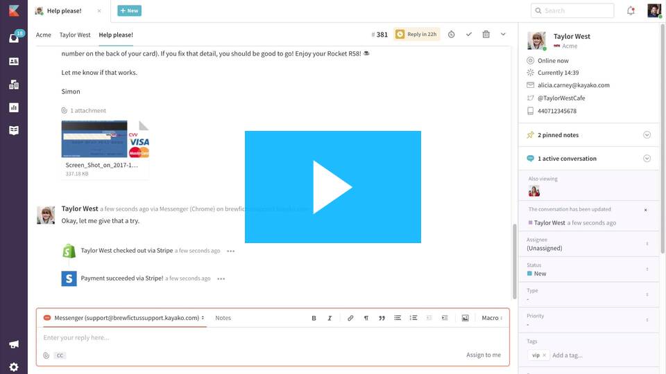
Here’s an example from ~6 years ago, where Alicia and I created a walkthrough video that was originally gated behind a lead form.
Apart from the embarrassing quality (we did it entirely ourselves!), I still like how we framed the narrative from a customer’s perspective, showed how the customer and end-user experiences intertwined, and made it feel engaging with a personal intro and outro from Alicia herself!

Make every video you make work harder
Think about each context you need demo videos for, and what they need to achieve.
Think about what your prospect needs to know from their perspective on their buying journey.
Then unite both with a consistent, customer-centric narrative that focuses on the value they ultimately desire.
Then get creative.
Thanks for reading! Let me know what you thought – find me on Twitter and LinkedIn.
P.S: If you enjoyed this post, will you share Building Momentum with your network?


