Hi, I’m James. Thanks for checking out Building Momentum: a newsletter to help startup founders and marketers accelerate SaaS growth through product marketing.
Get the next post in your inbox
Practical product marketing and GTM ideas, weekly.
Most SaaS websites treat product imagery like a checkbox: drop in a dashboard, a mockup, maybe a stock photo of someone pretending to use a laptop. Done.
But none of that really helps people understand what your product actually does, or why they should care. And if they can’t get that quickly, they’re probably not going to dig deeper.
Product imagery isn’t decoration.
It’s proof. It’s storytelling. More than that, it should reinforce the message you’re trying to land. Every visual you include should add clarity or conviction, rather than just filling a gap.
The product images that work best help people feel the value of your product before they even read the headline.
Here are some of my tips and examples to help you brief product images that just work better.
In this post:
What product imagery is actually for
Most visuals are wasted. They’re either too vague to be useful, or too dense to be legible. The goal of product imagery is to make your story click faster, deeper, and more believably than words alone.
Product imagery should back up the story you’re telling. It’s there to support your positioning and make your product feel real, not just sit alongside the copy.
Every image is a chance to signal something specific. If there’s a mismatch and your copy is pointing in one direction and your visuals say something else, it won’t work.
The best visuals don’t just support the narrative. They give people a way to visualise outcomes, not just features. They make the product easier to grasp, easier to remember and easier to trust.
Design for first impressions, not power users
Your product is built for people who use it every day. But your website and your deck are for people seeing it for the first time.
So while your existing customers might love the complexity and power, your marketing visuals need to massively simplify. Design for first impressions, not power users
Your product is built for people who use it every day. But your website and your deck are for people seeing it for the first time.
So while your existing customers might love the complexity and power, your marketing visuals need to simplify to deliver a more efficient mental model for viewers.
Stop showing the full UI
Screenshots of the full product interface feel like the obvious thing to show, but trust me: they’re rarely the right choice.
A full UI can look dense, busy, and difficult to decode, especially for someone who’s never seen your product before. They don’t know what matters. They don’t know where to look.
Here’s a real example from Intercom that shows where this can go wrong:
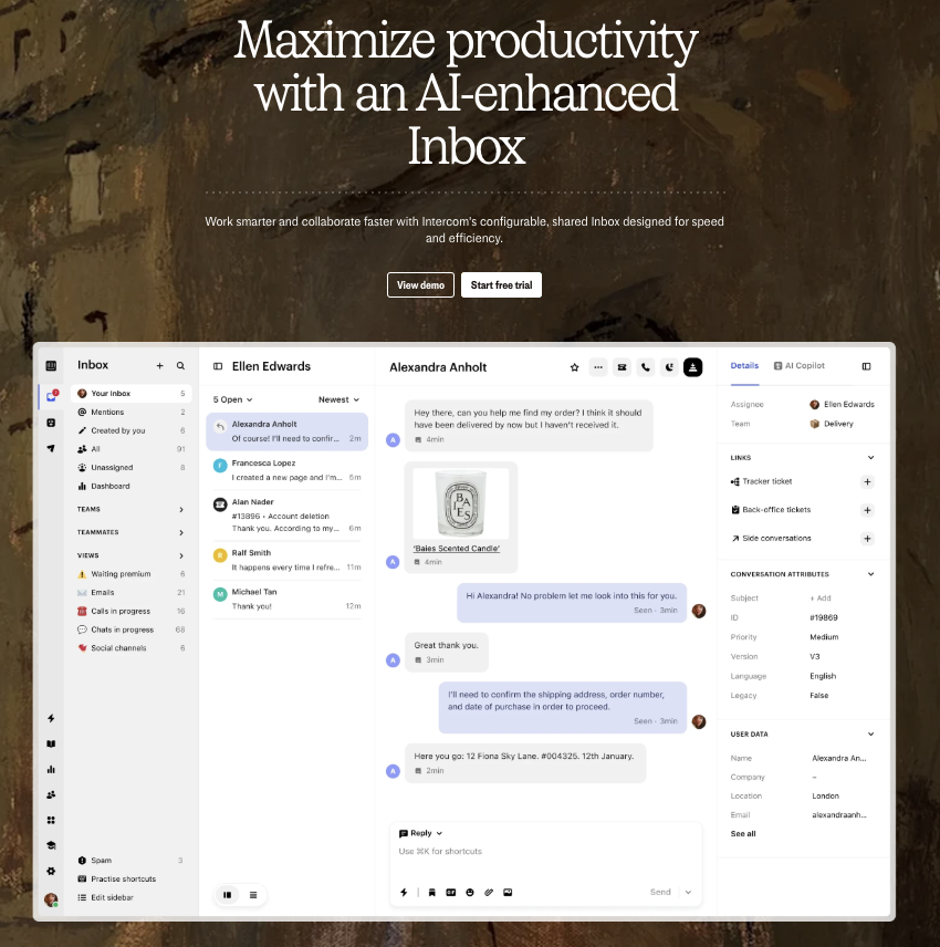
The intention is to show the power of the inbox. But the execution is overwhelming. The screenshot takes up a huge amount of space, there’s no visual hierarchy, and it’s unclear what you’re supposed to notice or care about.
It’s the UI version of word vomit. Everything is shown, but nothing lands.
Instead, I strongly suggest creating a consistent lo-fi language for your UI:
- Strip out the noise
- Crop the screen
- Blur the background or grey out irrelevant sections.
- Use redacted bars to simulate text.
- Replace real data with visual placeholders.
Lo-fi UI images give you control. It helps focus attention on what matters without overwhelming your user.
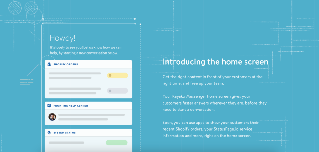
Here’s an example from Kayako (RIP):
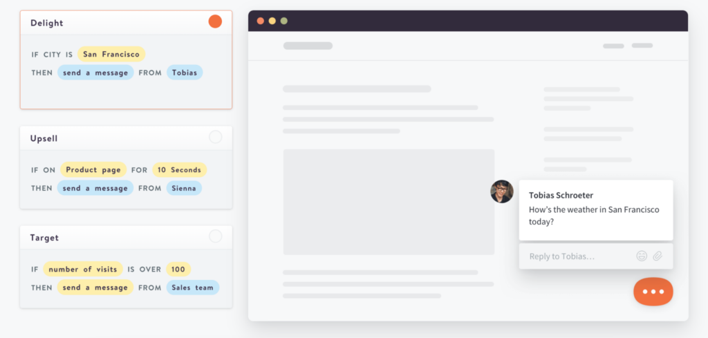
Notice how only the relevant pieces are shown. The logic blocks on the left clearly map to the action happening on the right, without needing a full, high-fidelity product walkthrough. Everything else is greyed out, abstracted, or simplified. There’s just enough context to make the idea land.
This is what good lo-fi looks like. It’s clean. It’s focused. It tells a story.
If your product has lots of capability, great. Don’t try to show it all at once. Sequence it. Let the visuals build understanding step by step.
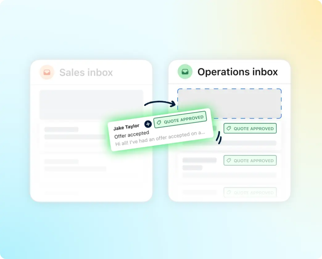
Show moments, not manuals
Product snippets are more useful than full-screen views because they help you isolate and elevate specific features, without forcing someone to make sense of the entire UI all at once.
A snippet is a self-contained piece of your product. It might be a single card, a chart, a dropdown menu, a modal. It’s something that stands on its own and represents a meaningful moment or capability.
Snippets give you flexibility. You can feature them alone, group several together, or build out a visual story using them as ingredients. They’re perfect for ads, landing pages, and decks where space and attention are limited.
Here’s an example from Remote that shows it in action:
You’re seeing multiple small UI elements brought together to tell a cohesive story. Each piece is simple enough to understand on its own, but together they hint at the broader capability without feeling overwhelming.
When used well, snippets help your product feel more dynamic, more real, and more relevant to the user’s world.
Don’t default to screenshots
Screenshots are useful in the right formats, like sales decks where you want to leave a particular impression. But they’re not always the right choice, especially when they’re trying to carry the full weight of your story on their own.
Clean, abstracted visuals of your product or features can be just as effective, and more so when they’re overlaid with illustrations to demonstrate movement or actions.
Here’s a great example from Front:
It’s simple, clean, and highly intentional. You immediately understand the concept being communicated without needing to parse a full UI. The illustration does just enough to land the idea, and nothing more.
And here’s another from Kayako that mixes illustration with lo-fi UI to land a slightly different feeling:
The use of blueprint lines is to reinforce the positioning: that this is something new, useful, and thoughtfully designed. It doesn’t try to over-explain. It creates mood and clarity at the same time.
That’s the power of a well-designed visual. It helps tell the story faster and better than a screenshot ever could.
They also let you dial in the emotion. A good illustration can soften the tone, bring in personality, and still be incredibly clear. The key is knowing what the image is there to communicate.
Make people feel like it’s for them
Even if your product isn’t fully localised, your visuals can still be.
Swap out currencies. Use familiar formats. Show names and languages that feel native to the audience. These small tweaks build relevance fast.
While you probably won’t need to go to this length, Remote localises images into 20+ locales… even dealing with long German words.
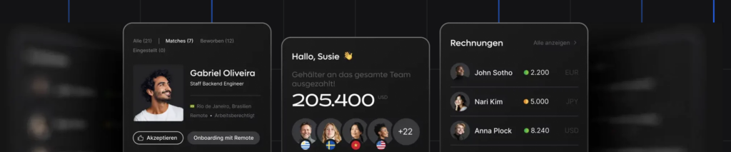
Even a few small changes like showing the right language, currency, or field labels can make it feel like the product was designed with them in mind.
Build a world, not a one-off
Instead of using lorem ipsum or fake placeholder data, create a consistent narrative that appears across your product visuals.
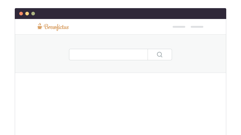
At Kayako, we introduced Brewfictus, a fictional coffee shop. The same customer tickets and internal team showed up everywhere from the website, and demos, to onboarding flows and ads.
Here’s one of the visuals we used. A fictional support thread, shown both as a live chat and a logged help desk ticket was just one of the 5 scenarios, 5 team members, and 5 customers that we designed for continuity, making the whole experience feel more real.
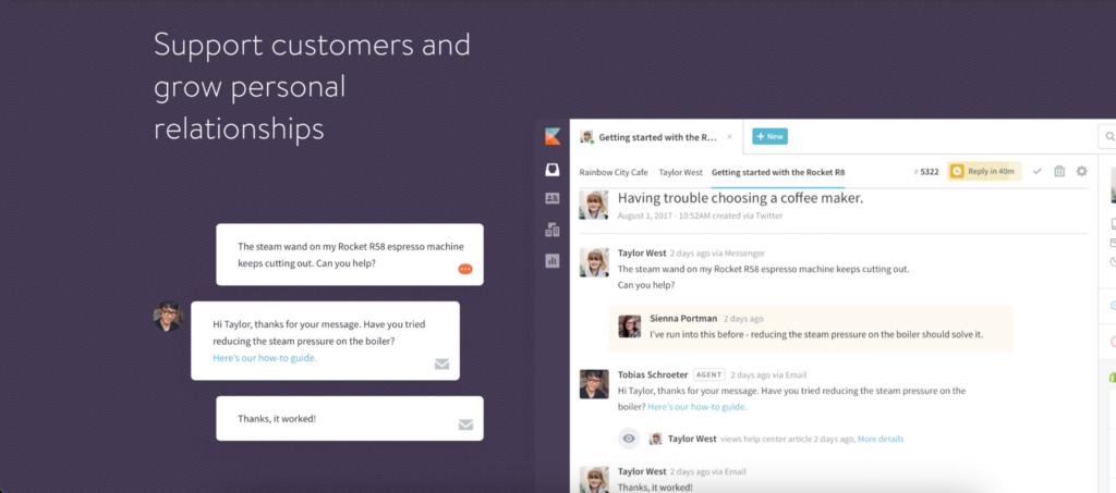
It grounded the product in a relatable use case—and helped people imagine themselves using it.
If you’re curious how far we took it, go check out the old Kayako site on the Wayback Machine. We built out Brewfictus across the entire site, it’s all still there: https://web.archive.org/web/20250328101152/https://kayako.com/
Show movement, not noise
Some ideas are better shown with motion.
A quick animation. A looped gif. A scroll or toggle to show how something works.
It doesn’t need to be complex. In fact, it shouldn’t be. Motion should serve the point, whether that’s showing a change, revealing an interaction, or contrasting two states.
Here’s an example from Kayako:
It’s clean, subtle, and purposeful. You immediately understand what’s happening. That’s all you need. It gets the point across without needing narration or additional visuals.
Use just enough to make it easier to understand, and no more.
Avoid stock images, duh
If you sell software, show the software.
Stock photos don’t hurt because they’re cheesy. They hurt because they introduce ambiguity. What am I looking at? What does this have to do with your product?
Visuals should make your product feel real, useful, and relevant. That could mean a literal UI shot. It could mean a stylised mockup. But it should always feel grounded in what you actually offer.
The real job of product imagery
Whether you like it or not, the truth is your visuals are doing one of two things: either helping someone believe, or making them work harder to understand.
Good product images should reduce friction, build trust, make benefits feel obvious… and outcomes feel within reach.
That’s what you’re aiming for. Images aren’t just decoration, or to fill th space, or just ‘showing the UI’.
Be intentional. Tell the story clearly, and let your visuals do the heavy lifting.
Thanks for reading! Let me know what you thought – find me on Twitter and LinkedIn.
P.S: If you enjoyed this post, will you share Building Momentum with your network?