Hi, I’m James. Thanks for checking out Building Momentum: a newsletter to help startup founders and marketers accelerate SaaS growth through product marketing.
Get the next post in your inbox
Practical product marketing and GTM ideas, weekly.
One of the most common questions I get is “what are examples of good positioning?”.
Unfortunately, it’s really hard to just ‘teardown’ positioning without knowing the strategy and decisions behind it.
While it’s easy to assess from the outside, there are many, many variables that affect the outcome of positioning from business strategy and customer feedback, to the experience and ability of those involved in the process.
If positioning is strategic, it would be foolish to think we can understand how objectively ‘good’ it may or may not be without knowing the context.
So that’s why – generally – I don’t do teardowns or criticize positioning.
But, I do offer examples of how I think positioning has been crafted well. It’s always possible to appreciate the craftsmanship that’s gone into how a company is presenting themselves to the world.
I want to offer a few examples of both good positioning and good messaging, in the hope you can find inspiration and confidence to level up your positioning.
In this post:
Examples of good positioning
First up is Shipamax – although, spoiler alert, I helped them.

Throughout the process, we discovered that their key buyers were looking for specific pieces of value that weren’t being addressed by competing solutions. By building these insights into the positioning, we were able to speak directly to customer value – and that translates into differentiation that galvanizes buyers.
For example, we understood that technical buyers wanted to be more directly involved in business growth, and not just seen as a supporting function. They also had grand plans to innovate processes across the business, but couldn’t get this done with a standard vanilla OCR solution.
We built this directly into the positioning, and then had some fun with messaging: ‘at last’ to speak to unblocking frustrations, ‘in a way that vanilla OCR just can’t’ as a not-so-subtle hat tip to alternative solutions.
Next, Truelayer. No affiliation this time!

I think this is a great example of clarity in positioning.
Firstly, the headline speaks to the value for the buyer: instant access to open banking.
Then, the description tells you how, and what the impact of that is.
It’s so simple that almost anyone can look at this and instantly grok who, how, what, and why.
To improve, I’d only recommend throwing some proof points into it. How quickly, exactly, can someone get up and running? Let’s quantify just how ‘instant’ ‘instant access’ is.
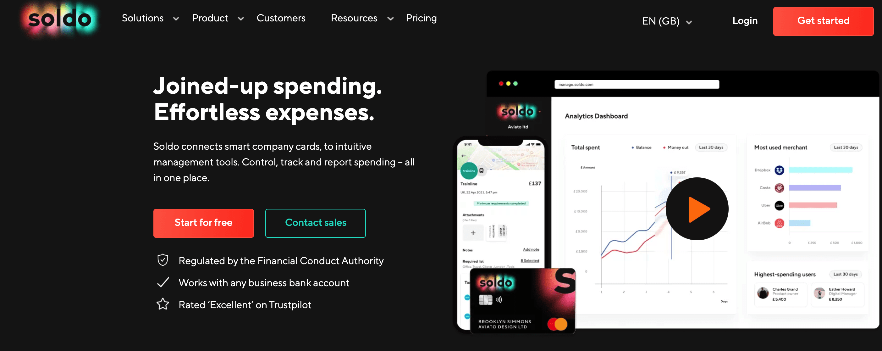
Lastly, Soldo.

One thing companies often want to do is outposition their competitors. If they go one way, we follow.
We assume this is because they have some unique experience or insights – but often, it’s the blind leading the blind.
I like this example from Soldo because it positions clearly in the gaps, the unmet area between the old and new worlds of expense management:
- New world: things like Pleo – easy spending with company cards, built for the spender
- Old world: things like Concur – expense management built for the company
We can see in the hero section how Soldo have communicated the value for both audiences – and then used proof points below to provide evidence.
Good examples of messaging
I wanted to highlight a few examples of where messaging could easily have been staid, boring, and bland – but has been given a new lease of life.

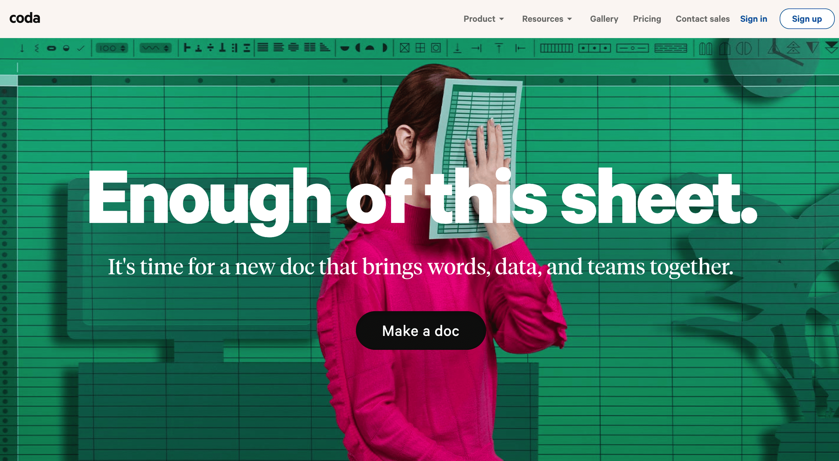
Coda is a great example of creativity in messaging. This could have easily been ‘no more spreadsheets’ or ‘say goodbye to spreadsheets’ – but somehow they summoned the courage to land on a pun with a swear word.

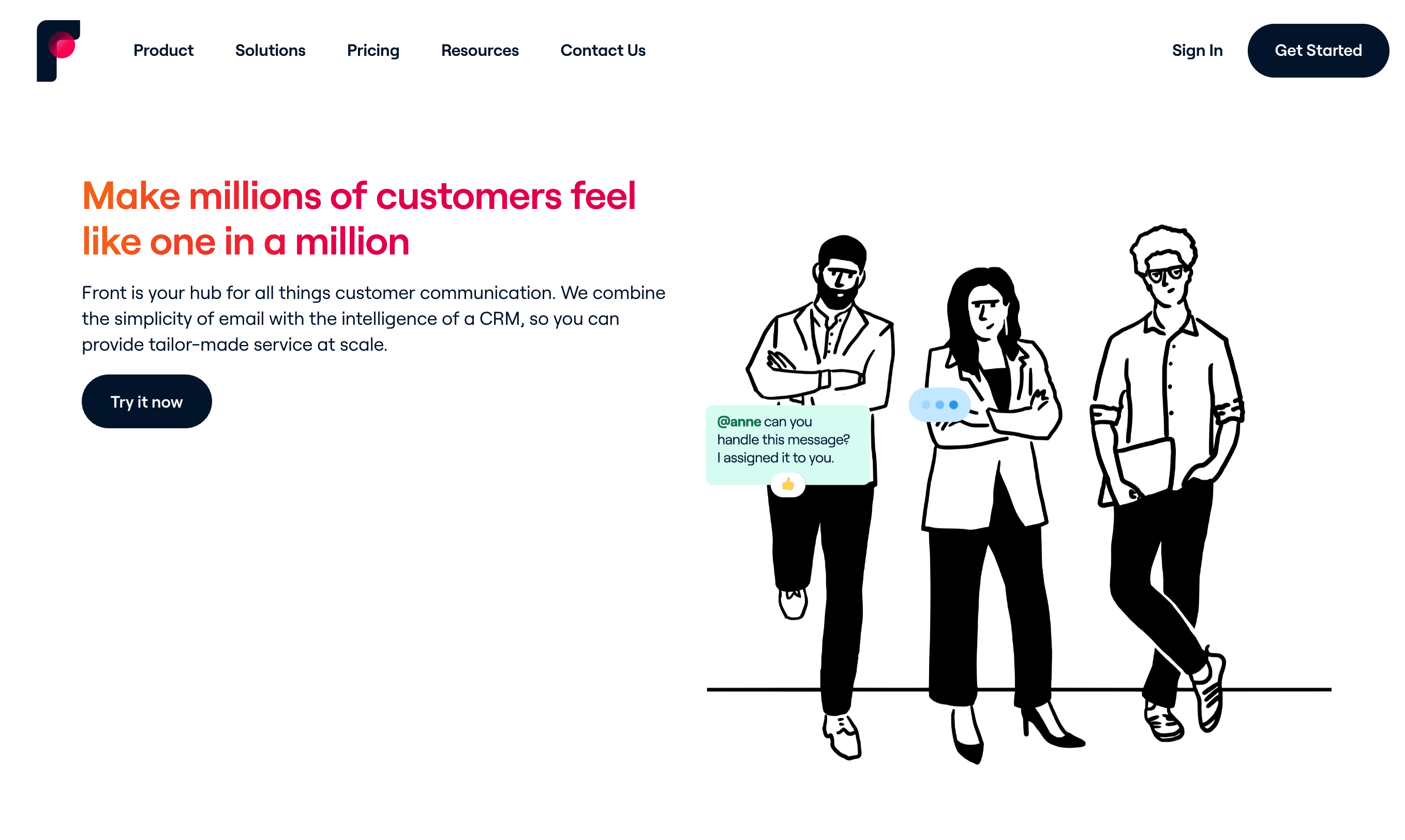
Front is a quality example of using tone-of-voice in messaging, just within a few words at the top of the homepage.
‘Make millions of customers feel like one in a million’ is aspirational, yet down-to-earth – and I expect they’ve landed on a value that their customers want to achieve. In fact, I bet they pulled this from a customer interview.
‘Front is your hub for all things customer communication’ just sounds like a friend telling you what it is. Simple, honest, direct, no fluff.
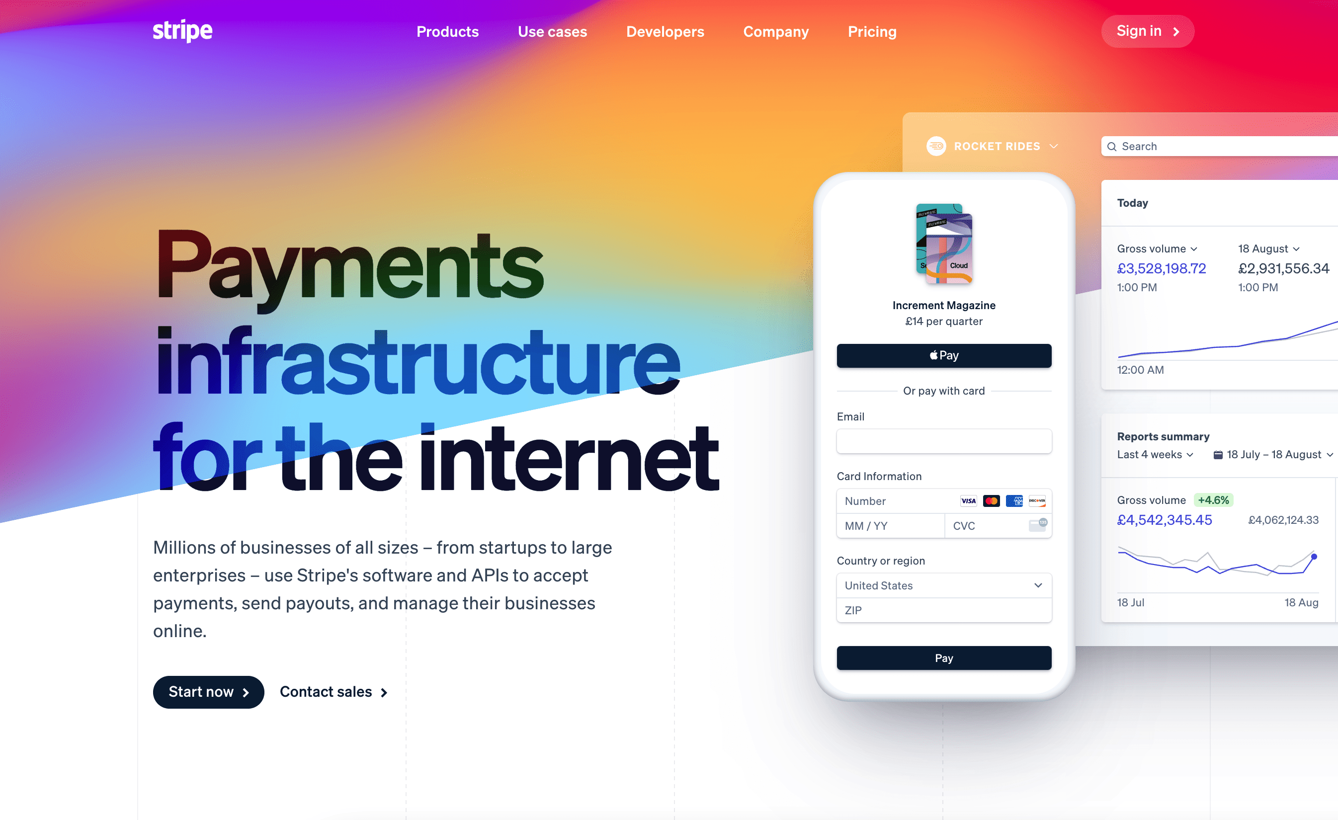
Lastly, Stripe. If you know about Stripe, you’ll know how many products they offer: the breadth, depth, and complexity.

I love how simple the homepage hero section is, for just a complex business.
Many other companies would’ve wanted to showcase their expertise and complexity as a badge of honor, but not Stripe.
Their mission and a really simple sentence communicates a number of different things to those arriving on the site:
- What Stripe does: payments infrastructure for the internet
- Who it’s for: startups to large enterprises
- What Stripe build (software and APIs)
- Social proof: millions of businesses
- The value customers achieve: accept payments, send payouts, and manage businesses online
But, it doesn’t feel overbearing or complicated. It’s accurate, brief, and clear.
What do you think?
What do you think is an example of good positioning? Maybe you think your messaging is great? Let me know!
Thanks for reading! Let me know what you thought – find me on Twitter and LinkedIn.
P.S: If you enjoyed this post, will you share Building Momentum with your network?


