Four pricing page considerations
Hi, I’m James. Thanks for checking out Building Momentum: a newsletter to help startup founders and marketers accelerate SaaS growth through product marketing.
Your pricing page is the second most important page of your entire website (after the homepage). It’s probably your second most highly-trafficked page, it can make or break someone’s decision to sign up for your trial or request a demo.
And unless you work at a large company with pricing analysts or deep pockets for expensive pricing consultancy projects, the design of your pricing page is probably going to fall down to two groups: product marketing, and brand design.
If there are no product marketers involved in your pricing page design, then what are you still doing here? Go and start collaborating on it now!
In an absence of direction, it can be difficult to know how you should think about the pricing page, let alone what should go on it.
Here are some of the core considerations that I’d think about when crafting a compelling pricing page.
In this post:
What’s your pricing page hero heading?
Don’t just put ‘Pricing’ at the top of your pricing page. It’s a wasted opportunity to frame the rest of the page and set the scene for how you want potential prospects to interpret the dollar amounts that follow.
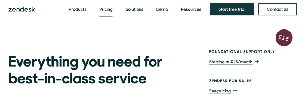
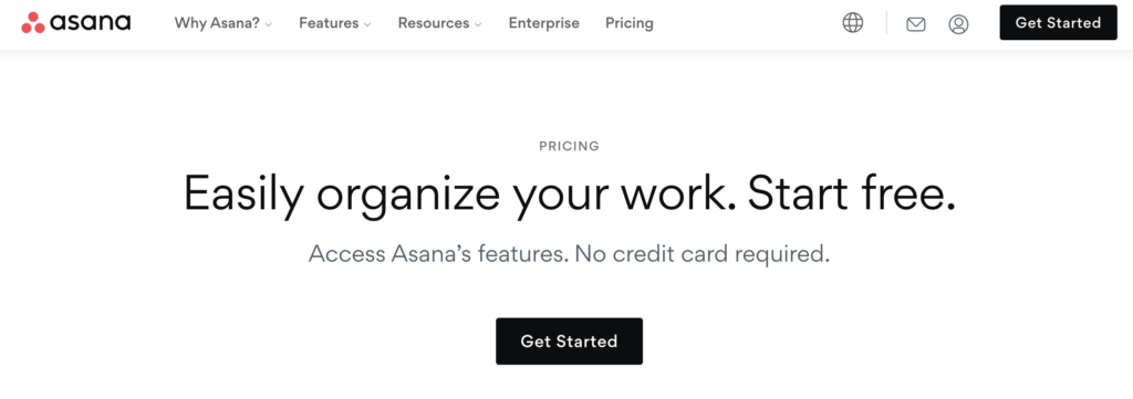
Take a look at these random samples from a selection of SaaS companies.


What do you notice?
Some are focused on their pricing being straightforward, simple, transparent. Start for free. No credit card required.
Others reiterate the value of the product. Build stronger relationships, organize your work, make teamwork more productive.
Others choose to highlight a combination of pricing and product value: everything you need, always know what you’ll pay.
Takeaway: Reiterate value
Hopefully, at this stage of your buyers journey, you know that buyers have questions they need to answer before they can move forward.
For some types of product, this might be something straightforward like “Is there a free trial?”, or “What’s included in the price?”, or “Is the product worth this price?”. It might be more complex, requiring your hero heading to elaborate on the specifics of your product, pricing, and value prop.
What should you call your product packages?
Most SaaS products will use a three-plan Good/Better/Best packaging structure, all increasing in price. Sometimes you’ll have a freemium entry tier too.
When developing these packages, we’ll stress for days on the dollar amounts but give little thought about the descriptive names that we’ll use internally and externally that almost everyone who engages with your brand will encounter at some point.
Generally, there a few options.
A ‘Good/Better/Best analogy’ approach will see you name plans in increasing levels of specialness, like:
- Silver, Gold, Platinum
- You can even get creative, like Freshdesk did with a nature-themed Sprout / Blossom / Garden / Estate / Forest
You may want to help users self-select a plan that’s right for them, like:
- Starter / Professional / Expert
- Team / Growth / Enterprise
Or maybe it’s about product capabilities:
- Support / Engage / Convert
- Inbox / Chat / Integrate
Takeaway: It depends (start with the customer-centric approach first)
Ultimately the names of your product packages will depend on the way your product is architected, whether compartmentalised by capabilities or if features can be accessed by different tiers of customers.
I recommend starting with the customer approach first – what will resonate with customers as they scan your site? What phrasing will they self-select as?
What plan should we highlight?
This isn’t even a question – the real question is, which plan to highlight?
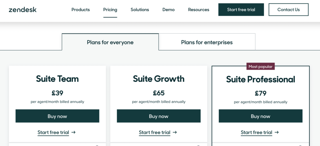
Adding a border, additional coloring, or badges can help a plan stand out. Usually, you’d use this to highlight the plan that most customers will select – the one that should catch their eye.
But it doesn’t have to be. You can experiment with placement, and depending on the intention of your design, highlight other plans that impact the perception of others.

Take Zendesk’s pricing page for example. They’ve highlighted their Suite Professional plan as an anchor, their highest page. Your eye is drawn there first. £79! Does that mean the £39 plan or the £65 plan is actually a great deal? I think so.

And now Asana: their £9.49 plan feels like an absolute steal compared to the £20.99 plan.
Takeaway: It’s all about perception
Unless your TAM is extremely small, we’re thinking about visitors in groups of thousands. What is going to have the biggest impact on the majority of visitors? Not edge-cases; the broad strokes of normal folk that visit your site.
All you can do is create multiple variations, and test in-house to see how they feel. Pricing is just as much as art as it is science.
The big one: to price, or not to price?
It really annoys me when I see Twitter and LinkedIn influencers trashing companies for not publishing pricing on their pricing page.
In my opinion, it’s 100% acceptable to have ‘by application only’ pricing on your website. If your customers are comfortable with that.
In an oft-quoted trope, customers that have small budgets will sweat the small stuff, bargaining over $5 discounts. Smaller customers are more likely to want – NEED – pricing on your website to decide whether they continue to evaluate or not.
More mature businesses usually move slower. They don’t make rash decisions. Budgets are larger (but not unlimited) … but everything can be negotiated. There’s a process for that. If the product says it does the right thing, we’re potentially interested. And so exact pricing is not necessarily required at the point in their journey in which they visit your pricing page (but they may want a ballpark figure in the discovery call).
Takeaway: It depends (on your pricepoint)
If your product is primarily self-service, then show pricing. If it’s mostly inbound-sales under $20k a year, show pricing. If it’s over $50k you’ll probably need to sell the value as well as the pricing structure, so don’t show pricing.
Of course you can always experiment. If you do show pricing, try ‘Pricing on request’ in place of a $ amount for your highest plan and see if you can eek out higher ACVs. Or if you’re already hiding pricing, try showing a ‘Starts at’ $ figure as a benchmark to set expectations.
Build, measure, learn
The last tip I can leave you with, is pricing is never done in a vacuum. Your product progress, sales skills, market landscape, the macro-economic environment, and whether Mercury is in retrograde can have a huge impact on how your pricing page is perceived by potential prospects.
Make sure you have a strong cadence to iterating. Put something out there, build a hypothesis for it. Measure the numbers, review the metrics. Make inferences, get feedback. Try again. Good luck!
Thanks for reading! Let me know what you thought – find me on Twitter and LinkedIn.
P.S. If you’ve found value in Building Momentum, could you buy me a coffee? Here’s my tip jar – any support is gratefully appreciated!
P.P.S: If you enjoyed this post, will you share Building Momentum with your network?

